
The harmony of interior design and color in clothing stores and boutiques is very important. These elements have a great impact on not only the visual appeal of the store but also on the customer's shopping experience. In this article, we will explain the importance of the harmony of design and color in clothing stores and boutiques by dividing it into specific points.
1. The importance of store design
First impressions for customers
The overall look of your store is what first catches your customer's attention.
A sleek design inspires trust and attracts customers.
Providing a pleasant shopping experience
A visually appealing space turns shopping into an enjoyable activity.
The right design encourages customers to stay longer in your store. 
2. The role of color harmony in design
The influence of color psychology
Each color has a different psychological effect:
White: Symbolizes cleanliness and simplicity.
Warm colors (red, orange): Gives vibrancy and energy.
Cool colors (blue, green): Inspire a sense of calm and security.
Black: conveys class and professionalism.
In harmony with the brand
It is important to choose colors that suit your brand and products.
Use contrasting colors in moderation to grab your customers' attention.

3. Choose colors to match your store style
Modern style store
Neutral colors like white, grey and black work well.
Adding metallic colors such as gold and silver creates a modern feel.
Classic style store
Uses warm browns and beiges.
Wooden furniture and decorations bring harmony.
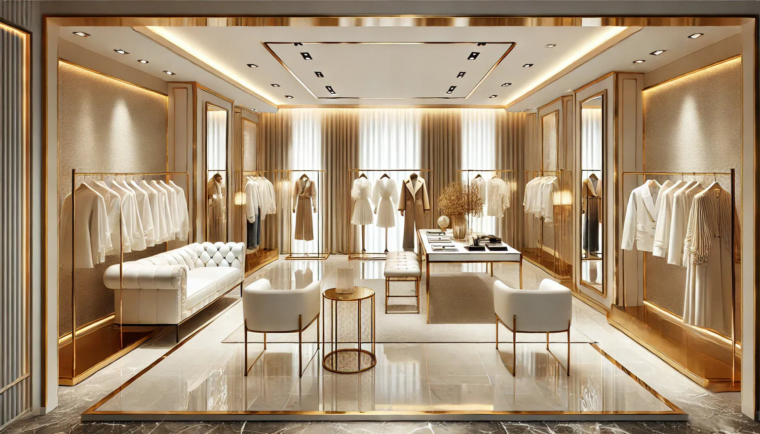
Luxury Boutique
The combination of gold and black emphasizes luxury.
Use lighting to bring out colors and details.
4. Principles of creating color harmony
Using the color wheel
Combining colors that are adjacent on the color wheel creates harmony.
The appropriate use of complementary colors enhances visual appeal.
Accent Color
Use one or two accent colors to grab your customer's attention.
It is effective as a focal point for logos, furniture, and displays.
5. Lighting and color combinations
How lighting affects color
Cold light can make colors look pale and inorganic.
Warm light adds depth and charm to colors.
Lighting Type
Ambient lighting provides overall brightness.
Spotlights highlight specific products.
6. Choosing the color of shelves and fixtures
Neutral colors: Use muted colors on fixtures to draw attention to your products.
Dark colors: Suitable for luxury boutiques.
Light colors: These can help make a small store look larger.
7. Choosing the wall and floor colors
Wall Color
White or pale grey walls provide a simple backdrop.
Use accent color walls in areas you want to highlight.
Floor color
Classic store with wooden flooring.
Modern stores feature simple, glossy flooring.
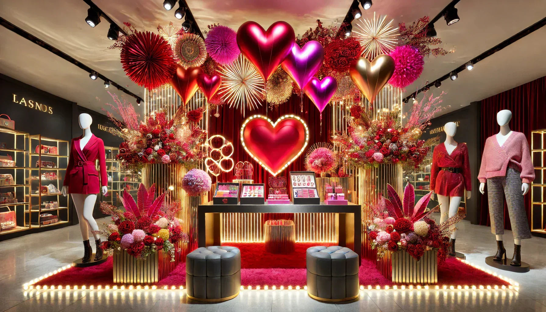
8. Choose colors for each season
Warm colors for the cold season
Red, orange and brown in fall and winter.
Cool colors for the warm season
Blue, green and white in spring and summer.
9. How color influences purchasing behavior
Attractive colors can help draw attention to a particular product.
Color-coded according to style and season to provide easy placement for customers.
10. Examples of successful stores
A famous boutique with a distinctive color scheme
Use contrasting colors to create an attractive and professional space. 
summary
The design and color harmony of your clothing store or boutique plays an important role in attracting customers' attention and increasing their desire to purchase. Use the points introduced in this article to maximize the appeal of your store.
▫️▪️▫️▪️▫️▪️▫️▪️▫️▪️▫️▪️▫️▪️▫️▪️▫️▪️▫️▪️▫️▪️▫️▪️▫️▪️▫️
📩 Contact Us <br data-end="52" data-start="49">If you have any questions, please feel free to contact us.
👉 【 Contact us here 】


